Financiere & Italianne Bastarde of Louis Barbedor

Financiere & Italianne Bastarde of Louis Barbedor
Level: Intermediate/Advanced (not recommended for absolute beginners)
Dates & Time: 8 to 9:30PM Hanoi Time GMT+7
August 31 & September 7 - 14- 21
Online Workshop via Zoom, recordings will be available after live sessions.
Level: Intermediate/Advanced (not recommended for absolute beginners)
Dates & Time: 9 to 10:30PM Hanoi Time GMT+7
August 31 & September 7 - 14- 21
Online Workshop via Zoom, recordings will be available after live sessions.
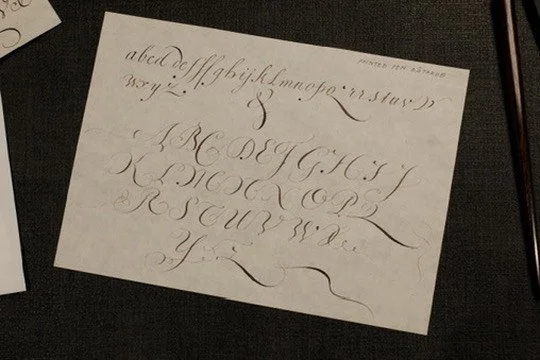
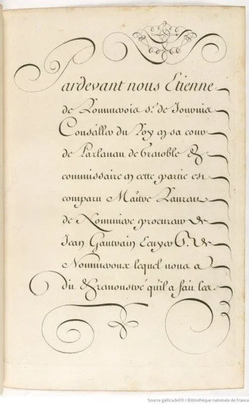
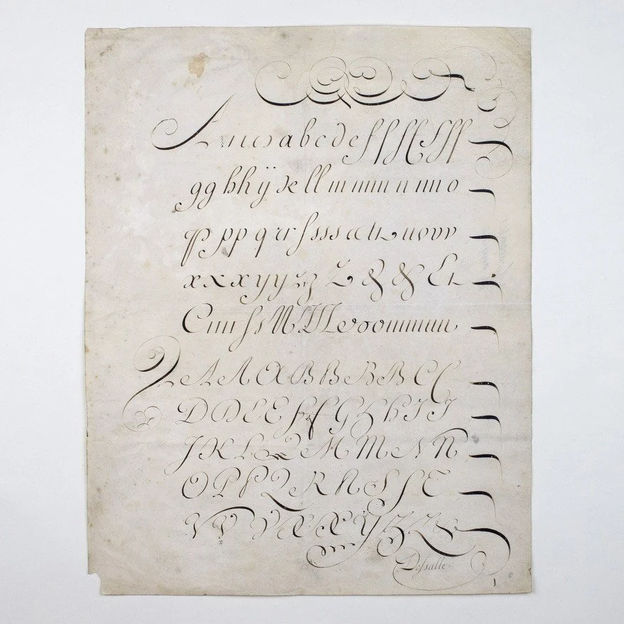
In the late 1650s, the French writing master and secretary to the chamber of King Louis XIV, Louis Barbedor, published an expanded version of his Traité de l’art d’escrire (“Treatise on the Art of Writing”), in which he presents only two styles of writing, declaring them to be the only useful hands for government documents: the financière and the italienne bastarde. Barbedor’s instructions for writing the italienne bastarde (which he saw as a near-universal hand for all sorts of nonfinancial documents) are precise: small letters slope 20 degrees to the right, are written with a broad-edged pen held at an angle of 22.5 degrees, and can be derived from the letters i and o. He does away with Cresci’s bulbous serifs on ascenders, either eliminating them entirely or replacing them with a little hook-shaped backstroke to the left of the letter stem. He treats capitals differently, writing them with a narrower flexible chisel-shape pen nib. Flourishes serve their original medieval function of preventing written additions to official documents or correspondence. His flourishes appear above and below the text and at the end of every writing line, and they are made with a pen similar to the one used for capitals. For the most part they appear too heavy for the writing and lack the grace of earlier Dutch and Italian pen decorations.
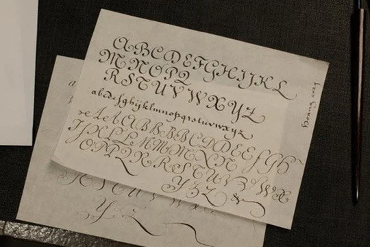
In this workshop, we will learn how to write the formal Ronde calligraphy as the base, then upgrade to the smaller, more flourished and contrast version - Financiere and Italianne Batarde - the adaption of Italiand Hand in French calligraphy.
Materials:
Straight pen holder
Broad edge nibs (Speedball C3 & C4 or Mitchell 03 & 05)
Pointed nibs (Gillott 303, Hunt 101 or Leonardt Principal)
Practice paper
Ink (highly recommend Fox & Quills ink or Walnut ink, shellac ink like Sumi is not preferred)
Some gouache and watercolor tubes, your preferred colors (I personally pick up Ultramarine Blue, Carmine Red or Vermillion, Gold/Silver, Ivory/Permanent White)
Ruler, eraser,…
Guidlines